UCLA Film & Television Archive Redesign

UX Research
Visual Design
Design Systems
Project summary

Developed design system and key screens to enhance usability and accessibility for seniors (65+) across mobile and desktop platforms.

Role -

Student UX Designer aiding in UXR, Design Systems, and Visual Design

For -

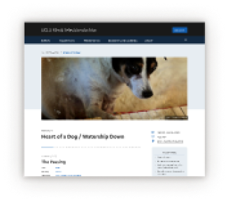
UCLA's Film & Television Archive

With -

Visual Designer • Serena Tie
Student UX Designer • Taylor Che

Timeline -

4 months

Contents
Problem Overview
Updating UCLA's Film and Television Archive website's UX/UI
UCLA's Film and Television Archive is one of the most prestigious archives in the world; however, its website does not highlight its impressive preservation & restoration work due to usability issues on desktop and mobile.
1. User Problem
Movie fans can't find upcoming film screening on the homepage
The main users of the archive's website are movie enthusiasts. They visit the Film and Television website primarily to find information about upcoming film screenings and tickets. However, the current organization of the website makes it hard for them to find these details.
2. Accessibility problem
Mobile usability is poor
The current mobile screens present usability and accessibility challenges. Small text and touch targets make it hard for our senior citizen end-users to navigate the website on mobile devices.
3. business problem
Collections page is underutilized
The UCLA Film & Television Archive is the largest university-held collection of motion pictures and broadcast programming in the world. However the website's collections tab on has low engagement.

My stakeholders wanted to faciliate exploration of it's collections tab and showcase it's significance to our users.
Main solution
Redesign the Film and Television Archive's website
Through interviews we found out what users and stakeholders wanted and needed. From that, we came up with these main goals to make sure the website redesign would be successful.
Redesign goals
  • Improve the user experience by helping users find the archive’s events and browse its collection.
  • Update the visual focus, improve mobile usability, and explore a lighter-themed aesthetic.
  • Help the end user achieve their primary goal of finding events and ticking information.
Mobile Homepage Before 😳

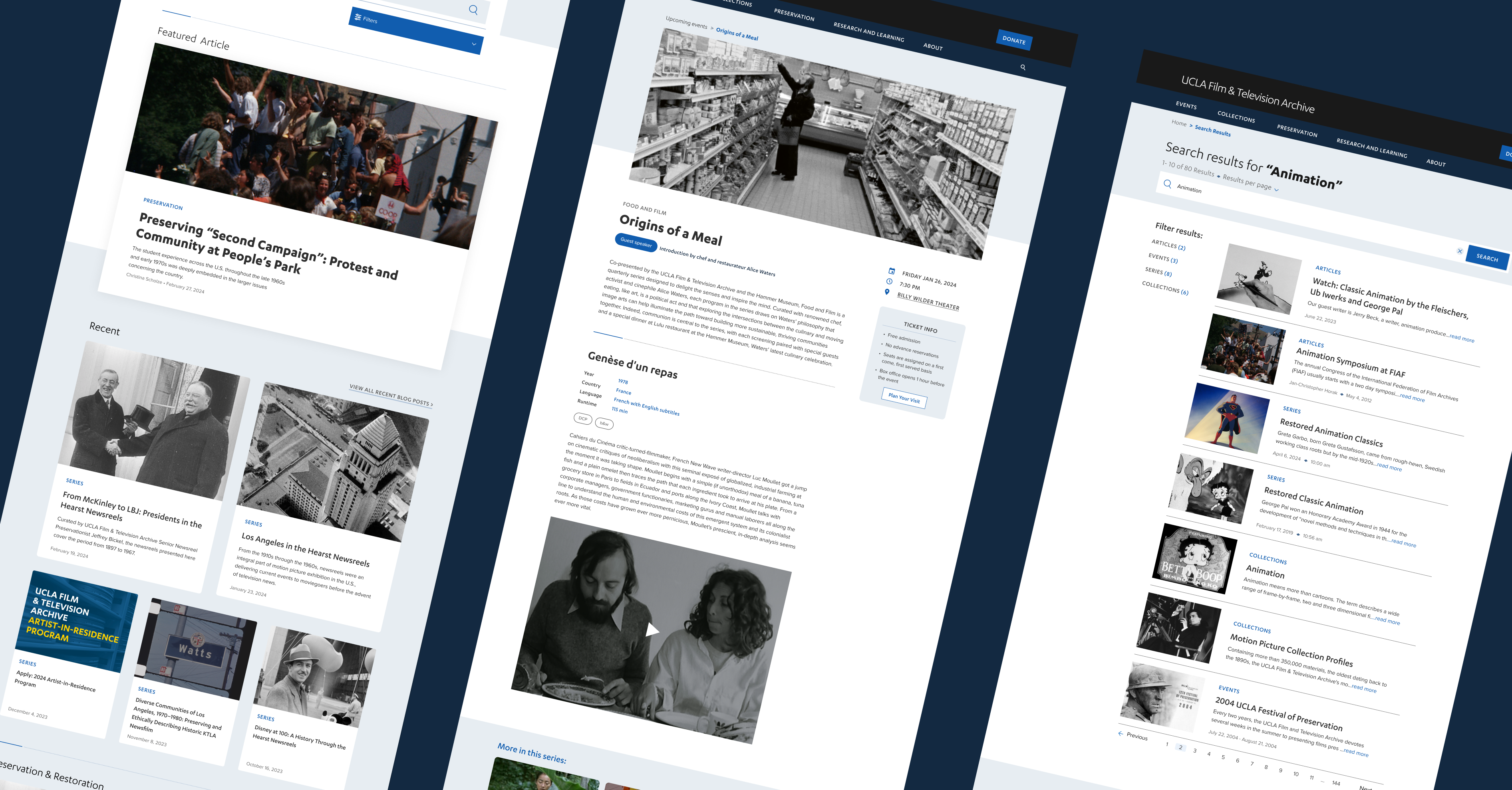
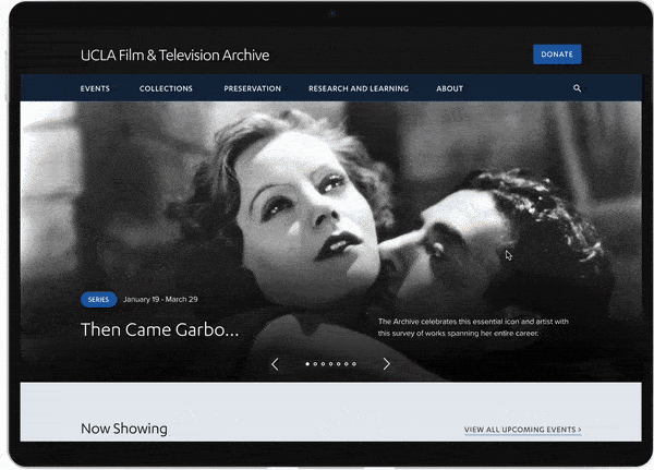
There are no links to see upcoming events or access the archive collections. Also, the blue link blocks are easily missed or accidentally tapped because they're too small.

Mobile Homepage After 🤩

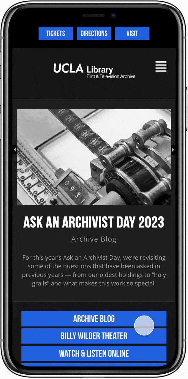
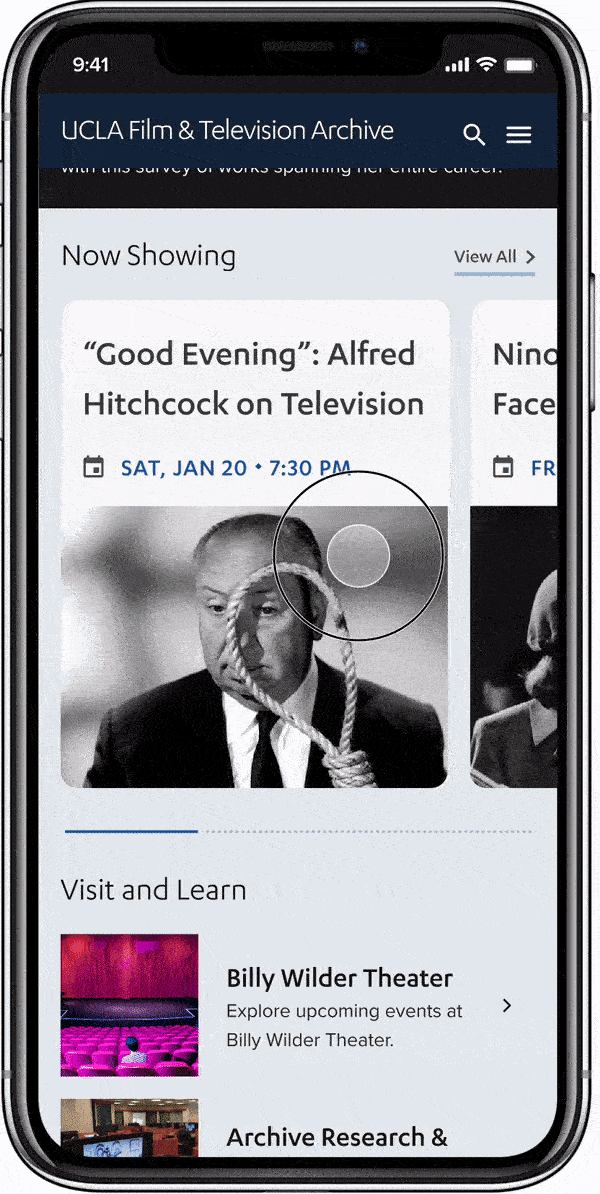
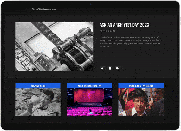
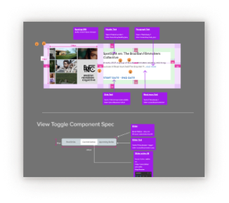
I added a horizontal carousel to showcase upcoming events and archive collections on the homepage. Additionally, I strengthed the visual hiearchy of the link blocks by wrapping them in larger containers.

Desktop Homepage Before 🤔

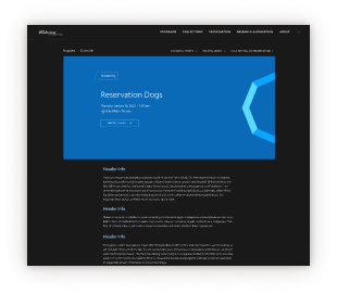
Vague wording for block links such as "Watch & Listen Online" and "LA Rebellion" made it confusing for users to predict what would happen once they clicked on a link.

Desktop Homepage After 😍

Restructuring the information architecture by grouping similar content by commonality while simplifying the site's wording lowers our users' cognitive load, thus improving usability.

User Research
Who is our primary user and what are their primary actions?
Through user interviews and data analysis from Google Analytics our primary users can be bucketed into four user types.
Film Fans
want to view upcoming screening calendar.
Researchers
want to access the Archive’s Collections
Peer Institutions
primary view programming history
Productions
are looking to license the archive’s materials.
Research Analysis
What are the needs and wants of our End-Users?
Through user interviews and data analysis from Google Analytics our primary users can be bucketed into four user types.
1
Updated Visuals
Modernize and simplify designs components.
2
Lowering Friction
Make access the archive’s resources quick and easy.
3
Discover Events
Highlight upcoming events to satisfy our primary users.
4
Show Resources
Bring attention to blog, collections, archive info.
Usually for me the first thing I really look at is the Billy Wilder Theater to just see what the screening events are and I'll usually click through that unless I'm coming to it for specific purpose to research or look for some information.”
— General Public
I use it mostly to learn about screenings, which I find the website to be the most helpful.”
— Graduate Student
Design Process
Jumping into visuals too quick
With the main goal of this redesign project was to improve the visuals of the website, I made the mistake of thinking about the design system’s colors and visuals.
Wait...but what about usability and our users?
I realized that our team had moved to high fidelity too quickly without consulting with our users if the foundation of our designs made sense to them!
Design Process
Improved Design Process
I simplified our wireframes to meet stakeholder needs, tested with end users for usability, and used feedback from stakeholders, users, and developers to finalize our design.
1. Low Fidelity
2. Usability Test
3. Mid Fidelity
4. Stakeholder Feedback
5. High Fidelity
6. Review with Devs
7. Design Specs
8. Celebrate
usability testing
Usability testing revealed pain-points while filtering events.
We iterated based on user’s feedback and dodged usability issues. Additionally, I conducted A/B testing for the filtering interaction when users search for upcoming events. Would they prefer a slider to show filters or a bottom sheet?
1
Confusing Mobile Experience
Modernize and simplify designs components and colors.
2
Filtering bottom sheets are best
Users enjoyed being able to see all of their filtering options in one place.
3
Confusing Language
Users were confused by terms such as “Virtual Events” and “Touring Series”.
Resolved Process
Finally feeling confident
Usability and A/B testing revealed navigation and content issues, boosting our confidence as we refined our prototype.

Users preferred filtering from a bottom sheet over a slider interaction.

Surprising insight: A participant mentioned that they preferred the slider filter even though they were unable to complete the task of applying filters.
Resolved Process
Component Standardization
As we neared completion of our designs, and prepared to hand off designs to engineering I raised concerns about inconsistencies among designers' work.

Between the visual designer and myself there were differences in spacing, text token usage, image aspect ratio and so on. To lower the level of engineering effort and to create a unified design across the entire website, I audited and created standardized components for our most used UI components, ensuring a cohesive user experience.
Resolved Process
Nearing the end
I'm wrapping up standardization work and getting ready to pass my designs to engineers. I am grateful that my team embraced my ideas for user testing and standardizing designs for a better user experience.
Lessons Learned

1.) "This is a Library NOT Tinder!"

In my visual design process, I defaulted to familiar styles from past roles, like those I used at Tinder. However, my approach clashed with the educational nature of the Film and Television Archive's branding. Feedback helped me understand the need for a more academic tone rather than trendy aesthetics. This taught me the importance of adapting design styles to fit each project's context.

2.) Prioritize Structure Over Visuals

As a new team member, I was eager to impress with my design skills. However, I often jumped ahead in the process, focusing on design system details instead of user needs in low-fidelity wireframes. This led discussions with stakeholders towards color and visuals rather than content or interaction. Realizing this, we shifted focus to low-fidelity prototypes, ensuring user needs were met before diving into visuals.

3.) Iterate, Iterate. Iterate!

I appreciated the opportunity for numerous design iterations in this project. Unlike my design classes where we often stick with the first idea, here we iterated based on feedback from stakeholders and users. This taught me the value of testing various solutions and refining based on feedback rather than being wedded to the initial concept.

Want to work together?

If you like what you see and want to work together, get in touch!